Landing Page Design for playcorner.id
If you’ve ever run or visited a traditional PlayStation rental shop, you know the drill: pen-and-paper logs, manual timers, and zero persistence for your game saves if you switch consoles.
For PlayCorner.id, we wanted to completely flip the script. Our goal was to build a modern, automated PS4 gaming rental platform featuring cloud save synchronization and an automated billing system. But before diving deep into backend services, functional event streams, and CLI integrations, we needed a front face that instantly communicated this tech-forward approach to local gamers.
Here is a breakdown of how we designed and built the PlayCorner.id landing page, the architectural decisions behind it, and how the visual design reflects the platform's underlying tech.
1. The Design Concept: "Developer-First" Meets "Gamer-Centric"
Most rental landing pages look like generic e-commerce sites. Because PlayCorner leverages an automated billing system and a custom CLI toolchain for session management, we wanted the design to lean heavily into a clean, modern, slightly "geeky" aesthetic.
2. Breaking Down the Technical Architecture
A great landing page isn't just pretty UI; it needs to be fast, type-safe, and highly maintainable. Here’s the stack and architectural mindset behind our implementation:
Component-Driven Structure
Using a modern frontend framework, we broke down the layout into highly composable, declarative components:
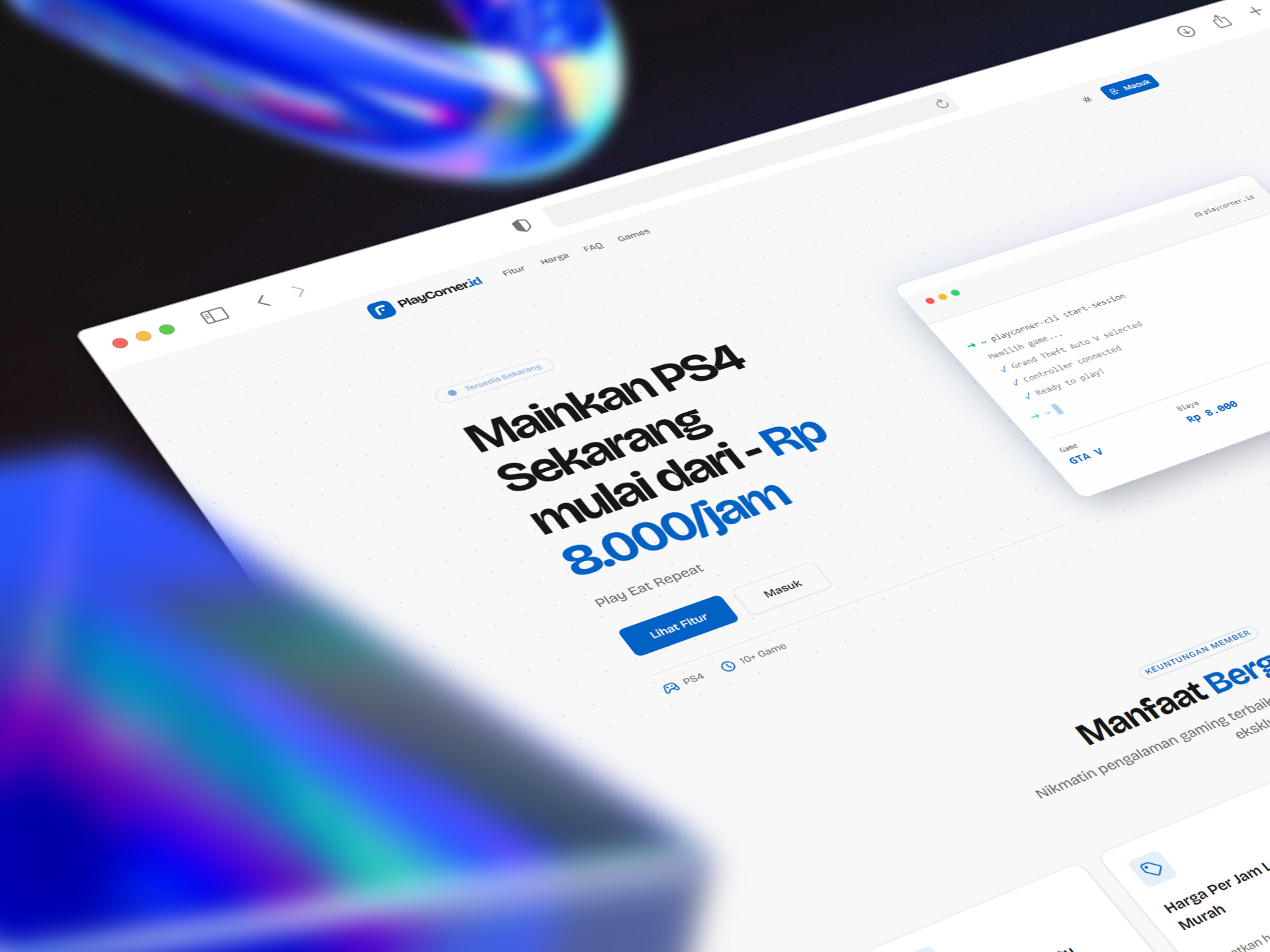
Navigation: A sticky, minimal header managing active route states and auth entry points (Masuk).Hero: Handles the main value proposition, primary call-to-actions (Lihat Fitur), and houses our interactive CLI mockup component.FeaturesGrid: A clean layout displaying card components for member benefits (Manfaat Bergabung).
Styling & Layout (Tailwind CSS)
To achieve the clean, high-contrast look without bloat, we used Tailwind CSS with strict spacing and custom typography configs:
Modern Typography: Sharp, highly readable sans-serif typefaces that fit the software-as-a-service (SaaS) vibe.
Glassmorphism & Shadows: The CLI mockup uses a sharp white background with a smooth, expansive box-shadow (
shadow-2xl) and subtle border-radius to lift it off the dotted canvas.Consistent Accents: A vivid primary blue is used intentionally for focal points—pricing, primary buttons, and icon accents—guiding the reader's eye naturally down the conversion funnel.
3. Designing for User Value: The Member Benefits
The lower section of the landing page focuses entirely on solving traditional rental pain points. We organized these into a responsive 4-column card grid:
FeatureWhat it SolvesBisa Simpan WaktuLeftover session time isn't wasted; it's saved to the user's profile for their next visit.Harga Per Jam Lebih MurahTiered member discounts (up to 20% off) encourage long-term retention.Reward MilestoneGamifies the platform by rewarding high-volume players with milestones.Bisa Request Install GameA community-driven feedback loop allowing users to vote on or request new titles.
4. Key Takeaways & What's Next
Building this landing page wasn't just an exercise in UI design—it was about creating an interface that accurately matches the sophistication of our backend. By showcasing the CLI interface directly on the home page, users instantly understand that PlayCorner.id is a friction-free, modern gaming experience.
With the landing page solid, our next steps involve tying these UI triggers directly into our backend services—handling concurrency, tracking local hardware power states, and ensuring that when a user clicks "Masuk", their cloud saves are seamlessly synced and ready to roll.
What are your thoughts on using terminal mockups in consumer-facing landing pages? Let us know in the comments below, or track our progress as we roll out the automated billing system next!
Gallery
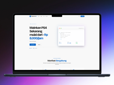
Laptop mockup displaying the PlayCorner.id landing page, featuring a bold headline for PS4 rentals and a simulated terminal window showing an automated CLI gaming session.
Gallery
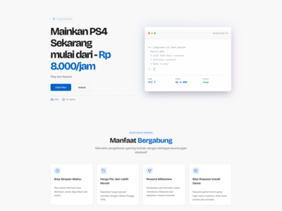
Full desktop screenshot of the PlayCorner.id landing page in light mode, showcasing the hero section and a four-column grid of membership features below it.
Published 2026-05-25 · Updated 2026-05-25