Building Happify Wedding: Crafting a High-Conversion Landing Page for a Digital Invitation SaaS
The wedding industry is undergoing a massive digital transformation. Traditional paper invitations are rapidly being replaced by elegant, interactive, and eco-friendly digital alternatives.
When we set out to build Happify Wedding—a premium digital wedding invitation SaaS—we knew that the competition would be fierce. To stand out, our platform couldn't just have great features under the hood; it needed a high-converting, visually stunning landing page that instantly established trust and sophistication.
Here is a look at the design decisions, technical considerations, and implementation strategies behind the Happify Wedding landing page.
1. The Design Philosophy: "Happily Ever Starts Here"
A landing page for a wedding service demands a completely different aesthetic than a typical developer tool or administrative SaaS. It needs to feel premium, romantic, and reassuring, while still maintaining clean software design principles.
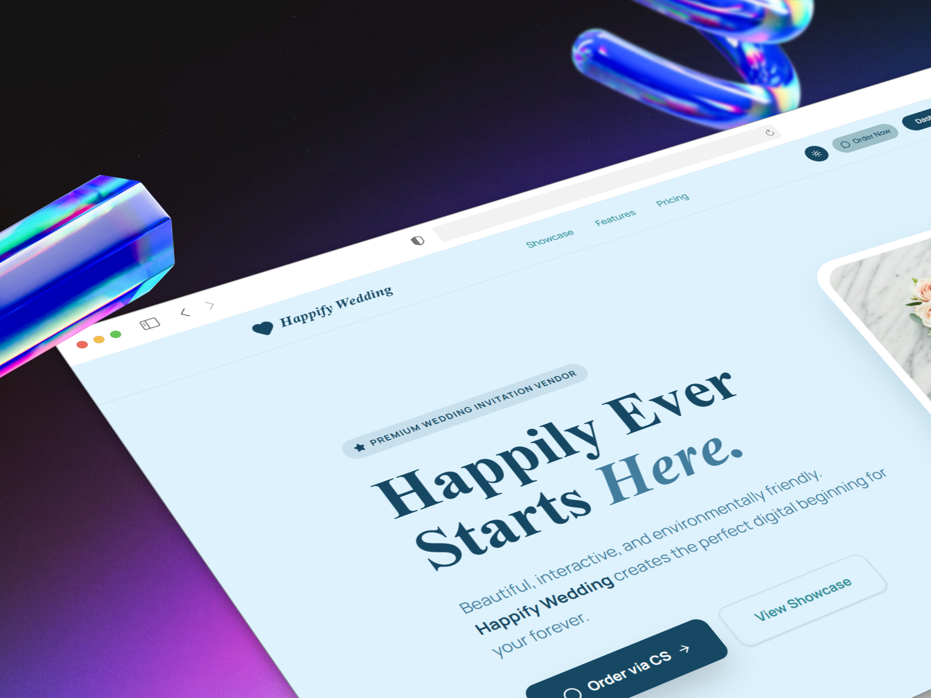
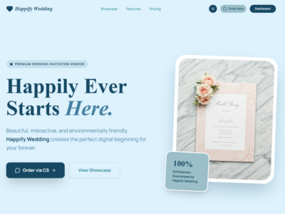
Color Palette & Typography: We selected a soft, elegant pastel blue background coupled with deep navy accents to provide contrast without feeling aggressive. For the typography, we paired a classic, graceful serif typeface for headings ("Happily Ever Starts Here.") with a clean, highly legible sans-serif for body copy to emphasize both elegance and modern tech.
The Hero Focal Point: Instead of a generic hero illustration, we used a high-fidelity preview card featuring a realistic digital invitation mockup set against a marble texture. This instantly shows prospective couples exactly what the end product looks like.
Trust Elements: We strategically placed a prominent "100% Satisfaction Guaranteed" badge directly below the image preview to alleviate any hesitation right at the first point of contact.
2. Architectural & Technical Implementation
To ensure seamless performance, excellent SEO rankings, and clean maintainability, we leaned into modern web engineering practices:
Component-Driven Layout: The entire frontend is broken down into modular, highly reusable components. This ensures that sections like the
Navigationbar (featuring simple links like Showcase, Features, and Pricing) and the mainHerolayout can be easily updated or extended as the SaaS grows.Utility-First Styling via Tailwind CSS: We utilized Tailwind CSS to achieve pixel-perfect layout controls. Precise margins, subtle image rotations, and soft transitions on buttons like
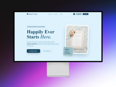
Order via CSandView Showcasewere implemented effortlessly without writing bloated custom CSS.Responsive Mockups: Using tools like Screen Studio to generate sleek monitor and browser mockups allowed us to present the landing page in a highly professional, realistic environment across our marketing materials.
3. Clear, Frictionless Conversion Funnels
The ultimate goal of a landing page is conversion. We designed the user flow to be as frictionless as possible:
Dual Call-to-Action (CTA): The primary button (
Order via CS) is styled with a high-contrast dark blue background to draw the eye immediately, providing an instant human touch point for users ready to buy. The secondary button (View Showcase) is minimalist, encouraging hesitant users to explore live examples first.Persistent Top Actions: The sticky navigation header includes quick-access buttons for users to see pricing, order immediately, or jump straight into their user dashboard.
What's Next for Happify Wedding?
With the frontend face established, our next architectural focus centers on the core SaaS engine: optimizing our dynamic invitation builder, managing user dashboards, and automating payment gateways so couples can create their dream invitations completely on autopilot.
What are your thoughts on balancing elegant typography with clean SaaS aesthetics? Let us know in the comments below, or stay tuned as we share more updates on building the automated invitation builder!
Gallery
Gallery
Published 2026-05-25